Blog Header
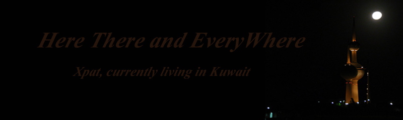
My friend and frequent commenter, Abdulaziz, created a new blog header for me. I don’t have a customizable header with this format, and while I have looked at the customizable ones, I don’t understand enough to make the leap. But I want to share with you what he created, using the photo Adventure Man and I took last week.
Isn’t it beautiful?
Related
October 5, 2007 - Posted by intlxpatr | Arts & Handicrafts, Blogging, Cooking, ExPat Life, Experiment, Friends & Friendship, Kuwait, Technical Issue
17 Comments »
Leave a reply to amer Cancel reply
-
Recent Posts
Blog Stats
- 2,916,332 hits
Pages
Meta
Recent Comments
intlxpatr on Give to Those Who Ask ExpatAlien on What Country am I Living … intlxpatr on Yellowstone: Old Faithful to C… Michelle on Yellowstone: Old Faithful to C… Cathy on No Grown-Ups in Charge Wikipedia Donate Button

Amazina

Early Voting in Florida

Archives
- May 2026
- April 2026
- March 2026
- February 2026
- January 2026
- December 2025
- October 2025
- September 2025
- August 2025
- May 2025
- January 2025
- December 2024
- October 2024
- September 2024
- August 2024
- July 2024
- June 2024
- April 2024
- December 2023
- November 2023
- September 2023
- August 2023
- July 2023
- May 2023
- April 2023
- March 2023
- February 2023
- January 2023
- December 2022
- October 2022
- September 2022
- July 2022
- June 2022
- May 2022
- April 2022
- March 2022
- February 2022
- December 2021
- October 2021
- September 2021
- August 2021
- July 2021
- June 2021
- May 2021
- April 2021
- March 2021
- February 2021
- January 2021
- December 2020
- November 2020
- October 2020
- September 2020
- August 2020
- July 2020
- June 2020
- May 2020
- March 2020
- February 2020
- January 2020
- December 2019
- October 2019
- September 2019
- August 2019
- July 2019
- June 2019
- April 2019
- March 2019
- November 2018
- October 2018
- September 2018
- August 2018
- July 2018
- June 2018
- May 2018
- April 2018
- February 2018
- January 2018
- December 2017
- October 2017
- September 2017
- August 2017
- July 2017
- June 2017
- May 2017
- March 2017
- February 2017
- January 2017
- December 2016
- November 2016
- October 2016
- September 2016
- August 2016
- July 2016
- June 2016
- May 2016
- April 2016
- March 2016
- February 2016
- January 2016
- December 2015
- November 2015
- October 2015
- September 2015
- August 2015
- July 2015
- June 2015
- May 2015
- April 2015
- March 2015
- February 2015
- January 2015
- December 2014
- November 2014
- October 2014
- September 2014
- August 2014
- July 2014
- June 2014
- May 2014
- April 2014
- March 2014
- February 2014
- January 2014
- December 2013
- November 2013
- October 2013
- September 2013
- August 2013
- July 2013
- June 2013
- May 2013
- April 2013
- March 2013
- February 2013
- January 2013
- December 2012
- November 2012
- October 2012
- September 2012
- August 2012
- July 2012
- June 2012
- May 2012
- April 2012
- March 2012
- February 2012
- January 2012
- December 2011
- November 2011
- October 2011
- September 2011
- August 2011
- July 2011
- June 2011
- May 2011
- April 2011
- March 2011
- February 2011
- January 2011
- December 2010
- November 2010
- October 2010
- September 2010
- August 2010
- July 2010
- June 2010
- May 2010
- April 2010
- March 2010
- February 2010
- January 2010
- December 2009
- November 2009
- October 2009
- September 2009
- August 2009
- July 2009
- June 2009
- May 2009
- April 2009
- March 2009
- February 2009
- January 2009
- December 2008
- November 2008
- October 2008
- September 2008
- August 2008
- July 2008
- June 2008
- May 2008
- April 2008
- March 2008
- February 2008
- January 2008
- December 2007
- November 2007
- October 2007
- September 2007
- August 2007
- July 2007
- June 2007
- May 2007
- April 2007
- March 2007
- February 2007
- January 2007
- December 2006
- November 2006
- October 2006
- September 2006
Catagories
- Advent
- Adventure
- Afghanistan
- Africa
- Aging
- Air France
- AirTag
- Alaska
- Arts & Handicrafts
- Beauty
- Biography
- Birds
- Biscuits
- Blogging
- Blogroll
- Books
- Botswana
- British Isles Viking Jupiter
- Building
- Bureaucracy
- Character
- Charity
- Chocolate
- Christmas
- Circle of Life and Death
- Civility
- Climate Change
- Cold Drinks
- color
- Communication
- Community
- Cooking
- corruption
- Counter-terrorism
- Crime
- Cross Cultural
- Cultural
- Customer Service
- Detective/Mystery
- Dharfur
- Diet / Weight Loss
- Doha
- Easter
- Eating Out
- Economic Issues
- Education
- Eid
- Entertainment
- Entrepreneur
- Environment
- EPIC Book Club
- Events
- Exercise
- ExPat Life
- Experiment
- Faith
- Family Issues
- Fiction
- Financial Issues
- Fitness / FitBit
- Florida
- Food
- France
- fraud
- Free Speech
- Friends & Friendship
- Fund Raising
- Gardens
- Generational
- Geography / Maps
- Germany
- GoogleEarth
- Gulf Coast Citizen Diplomacy Council
- Halloween
- Health Issues
- Heritage
- History
- Holiday
- Home Improvements
- Hot drinks
- Hotels
- Humor
- Hurricanes
- Hygiene
- India
- Interconnected
- iPhone
- Iran
- Ireland
- Italy
- Joke
- Jordan
- Just Bad English
- Kenya
- KLM
- Kuwait
- Language
- Law and Order
- Leadership
- Lectionary Readings
- Lent
- Lies
- Living Conditions
- Local Lore
- Locard Exchange Principal
- Lumix
- Mardi Gras
- Marketing
- Marriage
- Mating Behavior
- Middle East
- Money Management
- Morocco
- Movie
- Moving
- Music
- New Orleans
- News
- Nigeria
- NonFiction
- Oman
- Pakistan
- Parenting
- Paris
- Pensacola
- Pet Peeves
- Pets
- Photos
- Poetry/Literature
- Political Issues
- Privacy
- Public Art
- Qatar
- Qatteri Cat
- Quality of Life Issues
- Ramadan
- Random Musings
- Rants
- Recipes
- Relationships
- Renovations
- Restaurant
- Road Trips
- Safety
- Satire
- Saudi Arabia
- Scams
- Seattle
- Shopping
- Social Issues
- South Africa
- South Sudan
- Spiritual
- Statistics
- Stranger in a Strange Land
- Sudan
- sunrise series
- Sunsets
- Survival
- Tag
- Tanzania
- Technical Issue
- Thanksgiving
- Tibet
- Tools
- Transparency
- Travel
- Tunisia
- Turkey
- Uncategorized
- Values
- Venice
- Weather
- Wildlife
- Women's Issues
- WordPress
- Words
- Work Related Issues
- YMCA
- Zakat
- Zambia
- Zanzibar
- Zimbabwe
Blogroll
- A.Word.A.Day
- Global Incident Map
- Global Voices Online � Kuwait
- Google Earth
- Google Earth Blog
- John Lockerbie Gulf design
- Kuwait Paper Dump
- National Public Radio
- Ogle Earth
- Operation Hope – Kuwait
- Robin Pope Safaris Zambia
- the Journey: Kisses From Katie
- The Lectionary
- Weather Underground
- Wind Map
- WordPress.com
- WordPress.org


Its a bit too dark, I can barely see the writing. (I dont know if thats from me or if the Header is like that)
But the pic is lovely.
No, dark, I want more bright stuff, like a Rio Parade.
It is dark bas if the font color changes, might be ok – to yellow maybe
ooooh – I like it! the black sets of the photograph beautifully, and the font color echoes the color of the Kuwait Towers by moonlight. Beautiful, Abdelaziz!
Yes, Lady, I think there needs to be a little more contrast between the writing and the black background, so it can be more easily read.
Purgatory – YOU can have a Rio Parade! Bravo! Bravo!
No! No! Thank you, Chikapappi for the suggestion, but no! I don’t know why, but I do not like yellow! It reminds me of pus, and cholera, and safety violations!
He really did a sensitive job, didn’t he Little Diamond, I even love the font, but I do think the lettering needs to be a little lighter to be more readable.
The words are dark my friend!!! but the pic looks good
lighten the words maybe white or red or yellow
and italize either the title or the author description, not both.
Why not modify ‘xpat, currently living in Kuwait’ to something more catchy like ‘An Expat’s Kuwait’ or ‘Kuwait: Through An Expat’s Viewfinder’ etc – hell run a competition here and let us post our answers, make it a topic
It’s good as it is, It would make a nice header indeed 🙂
very, though the font isnt. but nice
its too dark! but its nice..
I’m guessing it comes up differently on individual pc’s, because I can just barely see that there is script at all, but from what I can tell, it is lovely.
Adiamondinsunlight you got it spot on! the font color was meant to reflect the color of the towers at night. it looked ok when i did it on my computer, i agree it needs to be in a lighter color now that i see it on the blog !
and thanks all for your kind words..
if the text was light gold, it would be sexier ;D
Thank you all for your input. I actually love the header, and I am not normally a “dark” person, but I love the drama of it! And you all said “yellow” but Swair said “gold”. I can live with gold, but I can’t live with yellow.
And Amer is right, I need to change the wording. You know how it is when you start a blog and all of a sudden you have to change all these things you never gave a thought to . . .I’ll need to do some thinking about that. Maybe one day I’ll even have the time to customize a header, thanks to YOU, Abdulaziz – that was inspiring! 🙂
A little dark but lovely! 🙂
Thanks, N. I can’t take any credit, it was Abdulaziz. I love it, except I agree the lettering would need to be lighter.
Yeah, what most people said :]
Ya nice but too dark, it doesn’t reflect your sweet personality 🙂
Check out my new header, I took that pic in Capri.